
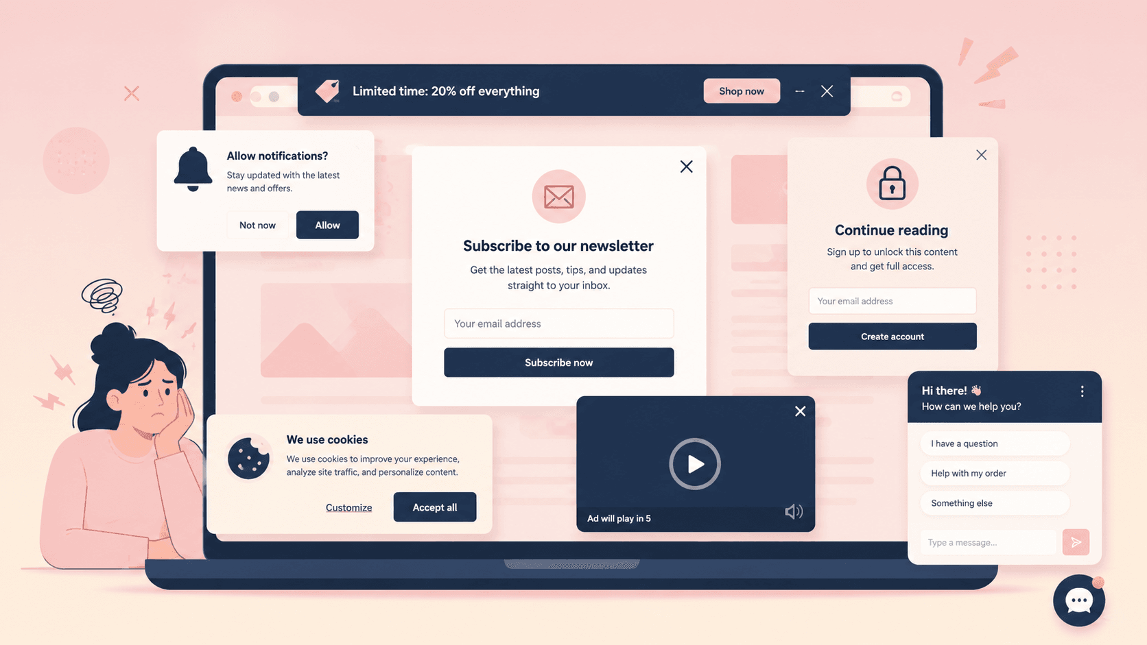
The site How I Experience Web Today popped back into my feed recently. If you’re not familiar, it’s a site that’s been around for a while that recreates what it actually feels like to click a link and read a page on the internet.
You land on what looks like a bare "Example Domain" page, click through, and then get hit with the full stack of internet inconveniences, layer by layer:
- A cookie consent banner with four sub-categories to review
- A browser notification prompt asking permission to send you updates
- A chat bubble opening on its own to ask "How can I help you?"
- An account wall
- A "50% off unlimited access" subscription pitch
- A paywall offering to sell you the single article you clicked on
- An ad or four
- A video that won't play until you click through a preroll
- A "sorry, this content isn't available in your country" message
- And once you've survived all of that, a "rate your experience" prompt
It's either funny or infuriating because it's accurate. It's also a useful way to talk about something that's easy to miss when you're the one building these things instead of the one hitting them.
Almost none of this is random, and almost all of it is still annoying.
Everyone in the Industry Knows Why This Happens
If you work in marketing, ecommerce, or growth, none of this site is a mystery. Each barrier exists because someone tested it and it worked.
The cookie banner is a legal requirement instead of a design choice. GDPR in the EU and a growing list of state laws in the US like the CCPA require sites to disclose data collection and, in many cases, get affirmative consent before tracking. The four-category breakdown (strictly necessary, performance, functional, targeting) exists because regulators specifically asked for granular opt-in rather than a single accept-all button.
The email or account gate tests well because it works. Newsletter signups and free-account walls convert a meaningful share of visitors into an owned channel, meaning the company can reach that person again without depending on search or social algorithms that change without warning. Given how much traffic acquisition costs, a form that turns even 5% of visitors into a name and email address on file is hard for a marketing team to walk away from voluntarily.
Paywalls, subscriptions, and ads pay the bills. Geo-blocking usually is a licensing restriction rather than the publisher's choice. The content owner only has the rights to show that video or article in certain countries, and showing it elsewhere is a contract violation, not a UX decision.
Even "rate your experience" has a defensible logic. Product teams need a feedback signal that isn't just "did they buy something," and a simple star rating is cheap to collect at scale.
None of that makes any of it feel good to sit through. Understanding the incentive doesn't cancel the experience of being interrupted five times before you've read a sentence.
The Two Worst Offenders
Two things on that list stand out as genuinely more annoying than the rest, and it's worth being specific about why.
- The chat widget that opens itself is the clearest case of a tool built for one job doing damage in another. A chat bubble sitting quietly in the corner is reasonable. But a chat window that pops open uninvited, playing a sound or grabbing focus, while someone is trying to read is a different story. It interrupts a task the visitor was already doing and runs on the site's schedule instead of the consumer’s. These windows optimize for a support or sales metric at the direct expense of the reading experience that brought the visitor there in the first place.
- The notification permission prompt is worse, because it's not really about the current visit at all. It's asking for standing access to interrupt the visitor later, on their phone or desktop, indefinitely, in exchange for nothing they've been given yet. Browsers show it as a native OS-level dialog, which makes it feel more consequential and less dismissible than an on-page banner. Most sites ask for it immediately, before establishing any reason the visitor should want it. It's a high-commitment ask made at the moment of lowest trust in the entire visit.
How to Find the Right Balance
None of this means cookie banners, subscriptions, or chat support need to go away. It means most sites deploy them without any regard for timing or restraint, and that's the actual fixable problem.
A few things make a real difference without giving up the underlying business goal:
Ask for one thing at a time.
What How I Experience Web Today is trying to show is that one single popup isn’t so bad, but when five of them are stacked on top of each other before the visitor has read a word, they become annoying. Stagger asks so a first-time visitor sees at most one interruption per session beyond the legally required cookie notice.
Match the ask to the moment.
A notification permission prompt makes far more sense after someone has read three articles and clearly likes the site than on their first page view. Delaying an ask until there's earned context dramatically improves both the acceptance rate and how it feels to be asked.
Make the cookie banner genuinely one click for the compliant option.
The law requires the choice to exist, not that it be difficult to make. A clear "accept all" and "reject non-essential" side by side satisfies most regulations without forcing every visitor through four toggle categories.
Set default chat to closed, not open.
A chat icon in the corner does the job of being available without doing the job of interrupting. Auto-opening should be reserved for cases with real signal, like a visitor who has been idle on a pricing page for a while. Don’t make it a blanket rule for every new session.
Respect a no.
If someone dismisses the notification prompt or closes the newsletter modal, don't show it again on the next page load. Repeated asks after a decline show as not listening, and they cost more goodwill than the second attempt could ever recover.
The honest version of the tradeoff is that a site optimized purely for visitor comfort would convert worse, and a site optimized purely for conversion tests like How I Experience Web Today above would drive visitors away.
Most teams know this and still end up closer to the second one, because each individual barrier was added by a different team and tested in isolation. Take the time to look at the whole stack the way a first-time visitor does, and cut whatever doesn't survive being seen next to everything else.
And if you don’t have the time or know what to look for, work with a partner who can recommend the best possible customer experience.